A few weeks ago a newsletter landed in my inbox. You know, one of those newsletters that give you a summary of the real estate market in your area. So, I opened it and I saw the photos of a condo for sale in a building I’m pretty familiar with. The 1 bedroom, 1 den condo was virtually staged and I must say that the photos were really nice. Realistic furniture, beautiful colors, modern accessories. I mean, very well done and rendered.
However, after analyzing one of the images for a few seconds, I suddenly said to myself: “Wait a second, there’s something wrong here!” To be honest, I actually said that in Italian in a less elegant way, but the point is that there really was something crucial missing and I couldn’t understand why the image had been approved in the first place.
I do not publish the photo because, obviously, it is not my work and also because I do not like to criticize somebody else’s projects. I mean, we are all trying to do our best in this world. However, at the same time, I think that the following examples may be beneficial not only to realtors representing a property but also to graphic designers that may be great in rendering a space but don’t have an interior design and, most importantly, a home staging background to turn the image of an empty room into a winning marketing tool.
For this reason, instead of using the original photos, I made a few renderings that reflect exactly how the rooms were structured and how the furniture was placed within each one of them.
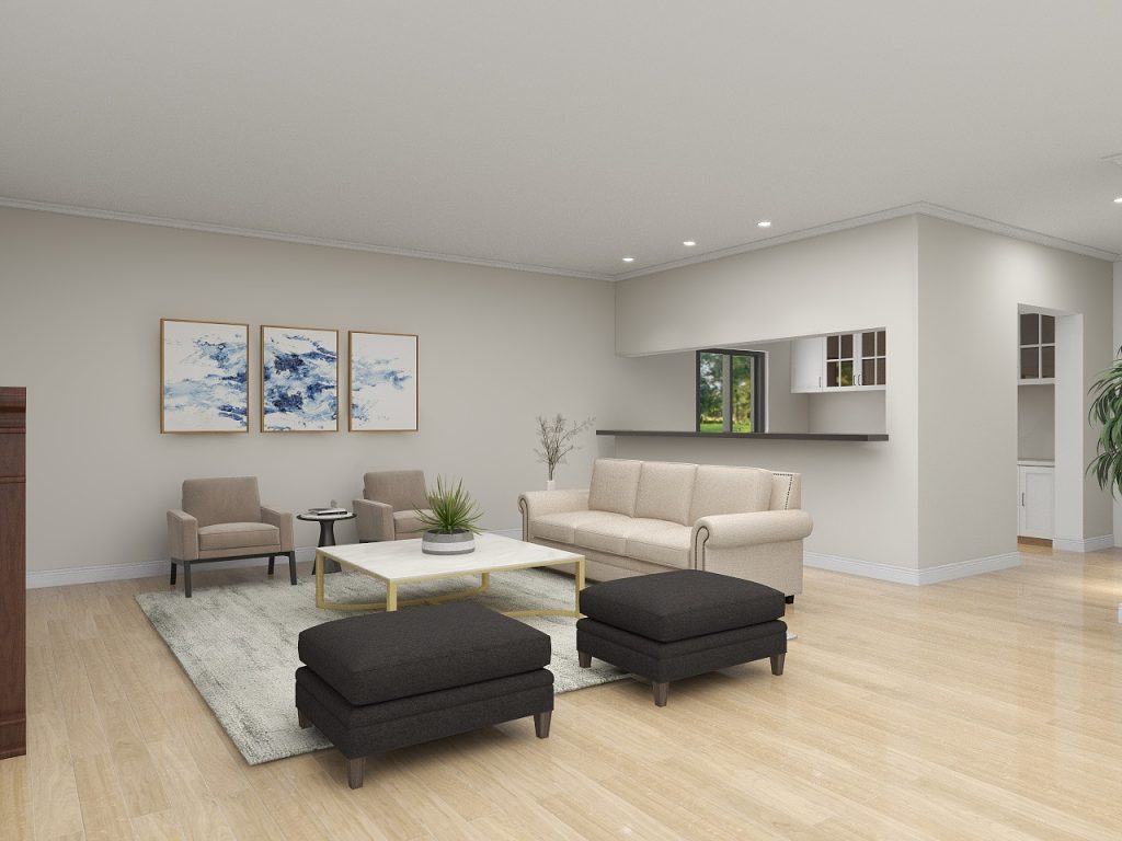
Mistake n.1: using the wrong furniture
This is how the room looked. Nice, right? Now, look at it carefully, what do you think is missing? To give you the right context and a little help, I can tell you that this is an 800 square feet condo with one bedroom, one den, and one bathroom.
As you can see, there is a small kitchen in the corner and then, right in front of it, a rather spacious room which has been staged as a living room. Only. And this is exactly the issue, where’s the dining room? Or better, where would these poor residents eat? There are not even the bar stools. Do they have breakfast, lunch, and dinner on the couch? I mean, you could, obviously, I actually had some friends who did not have a dining table. But they were crackers and cheese (and champagne) lovers and didn’t care about having guests over. So, it can work sometimes, but it doesn’t work when you represent a property for sale because the vast majority of people are not like my friends. Besides, this representation could be considered misleading. One may think that the dining room/area is somewhere else.
Below is how the room should have looked in my opinion (even no table would have been acceptable as long as there were at least three or four barstools.)
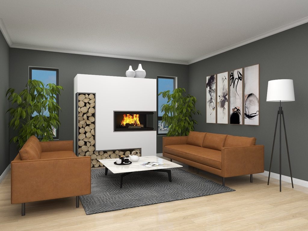
Mistake n.2: placing the furniture in the wrong spots
Before diving into this second mistake, I’m going to share the 3D rendering I did and that is a copy of the actual image. Let me just point out that behind that short wood-paneled wall there are some stairs.
As you can see, there is an inviting sitting area facing a super cool terrace and three sliding doors leading to it. Nice. There is also a sofa placed right in front of one of the sliding doors. Not nice, because unless you have no other choice, which sometimes happens with uber-complicated floor plans, you should never block access to doors and/or other important areas of the property.
In this case, this mistake was done not once but twice within the same image. Do you see that little rectangle above the stair wall in the left corner? That is actually a small door. I have no idea what’s behind that door, maybe a storage room or a hiding place for overwhelmed mothers, who knows, but the point is that they placed a bench right in front of it. Now, if you are a buyer, don’t you want to open that door to peek in?
What I mean is that you should treat virtual staging the same way you would treat traditional staging, and that is by placing the furniture correctly in order to help buyers visualize themselves living in the new property. This is true also for another mistake that comes from placing the furniture in the wrong way: misplaced furniture doesn’t highlight the most important selling points. For example, why would you place the sofa facing a boring wall instead of a terrace with a nice view? And even if the view is not nice, it is still a beautiful terrace, aka an important selling point.
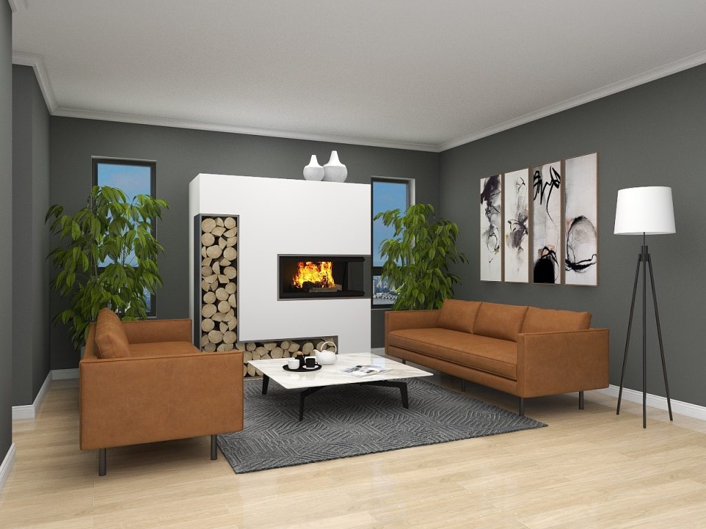
This is how I would have staged this room:
Mistake n.3: using potentially offensive items
If you look at the 3D rendering of this bathroom, copied from the original photo, you’ll probably think that there’s nothing wrong with it. It is a nice bathroom with modern pieces and neutral colors. However, if you look at the floor, you will notice that there is a cowhide rug used as a bathroom mat (confession: the original photo had actually a sheepskin rug, I used this one instead to add a pop of color, since I’m such a design freak).
The following is a rule that I learned during the decade I worked as a (traditional) home stager and that, if it wasn’t for the people that trained me in the very beginning, I wouldn’t have even thought about. When you virtually stage an image (or a real home for that matter), don’t use any item that represents dead animals, or a political and religious view because it could offend the sensitivity of the buyer.
Even though I cannot stand mats in a bathroom because they are a receptacle of hair, dust, and I don’t want to think about what else, I rendered a few alternatives to show you how you can replace the skin of the poor cow or sheep with something non-offensive (yes, that would be any mat that doesn’t look like a living creature).
Mistake n.4: staging too much
If by looking at this 3D rendering you think that the console table is unnecessary, I applaud you because you are definitely right. And I’d say that you probably already know why it is unnecessary. Correct, because it makes the kitchen smaller. See how narrow the walking area on the right of the island becomes? People love space, therefore using an item that goes against this important principle is counterproductive when your goal is selling a property.
It is not necessary to virtually stage every inch of the image therefore it is totally fine to leave some empty areas. Actually, by doing so, the room becomes less cluttered (you know, “less is more”, blah, blah, blah.)
So, here you go:
Mistake n.5: making assumptions
Ok, this is a tough one because if you look at this image it is hard to find something off. And as far as furniture, design, function, etc. there really is nothing wrong. However, I’m sure that once you see the next image you’ll understand right away what’s the problem.
This is the real layout of the living room: as you can see, there is the opening of a hallway right behind the couch on the left, but since the photographer zoomed in to take the photo, the virtual stager had no way to know that.
This is why for my virtual staging projects I always ask for a floor plan, a virtual tour (if I’m super duper lucky), and extra photos even if they are crappy or if they are taken with a flip phone. Anything that helps me get a perfect understanding of the layout and virtually stage the room in the correct way at the very first attempt.
In conclusion, my advice to real estate agents who use companies providing virtual staging is to look behind the nice photo and composition and to actually make sure that the property is represented in the correct way. In other words, pretend it is a real home staging. But most importantly, make sure you provide as much information as possible before starting the whole process to avoid too many revisions, mistakes and to save some precious time.
What is your experience with virtual staging? Let me know!
The practice of virtual staging has evolved significantly over the years. Initially, it involved basic furniture placement and limited customization options and it was clear the furniture was not real. However, with advancements in technology, virtual staging now offers more realistic and immersive experiences making the photos realistic and oftentimes unable to tell if it was virtually staged.


The practice of virtual staging has evolved significantly over the years. Initially, it involved basic furniture placement and limited customization options and it was clear the furniture was not real. However, with advancements in technology, virtual staging now offers more realistic and immersive experiences making the photos realistic and oftentimes unable to tell if it was virtually staged.