


If there’s one thing I’ve learned from my job, it’s that contrast is sometimes more important than color. Take this master bathroom for example: the overall color scheme was very neutral and light. For this reason I purposely introduced some dark brown elements such as towels, decorative boxes, candles, art, etc.
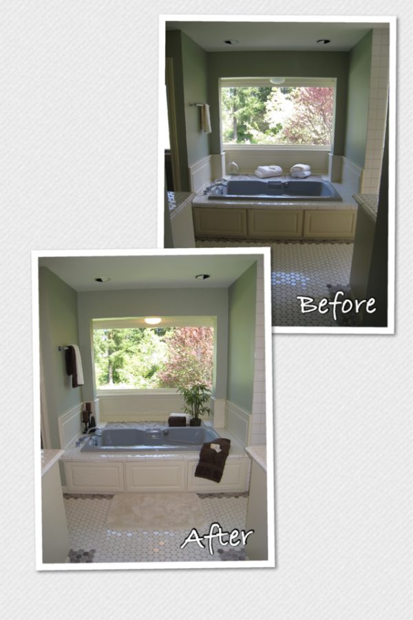
As you can see they really stand out without being too invasive, which is exactly what you need to complete a room.
Staging tip: “Think about contrast. Sometimes it is more important than color”.