2025 Paint Colors of the Year: Why More is Sometimes Better
When it comes to home decor, colors can really make or break the vibe of a space. Each year, big names in paint, like Sherwin-Williams and Benjamin Moore, release their Color of the Year picks. But while I love seeing fresh ideas, I’ve always been a bit skeptical of these “Color of the Year” selections. Why? Because, in reality, most people stick with tried-and-true neutrals that subtly change over the years.
Two Brands, Two Bold Approaches to Color Trends
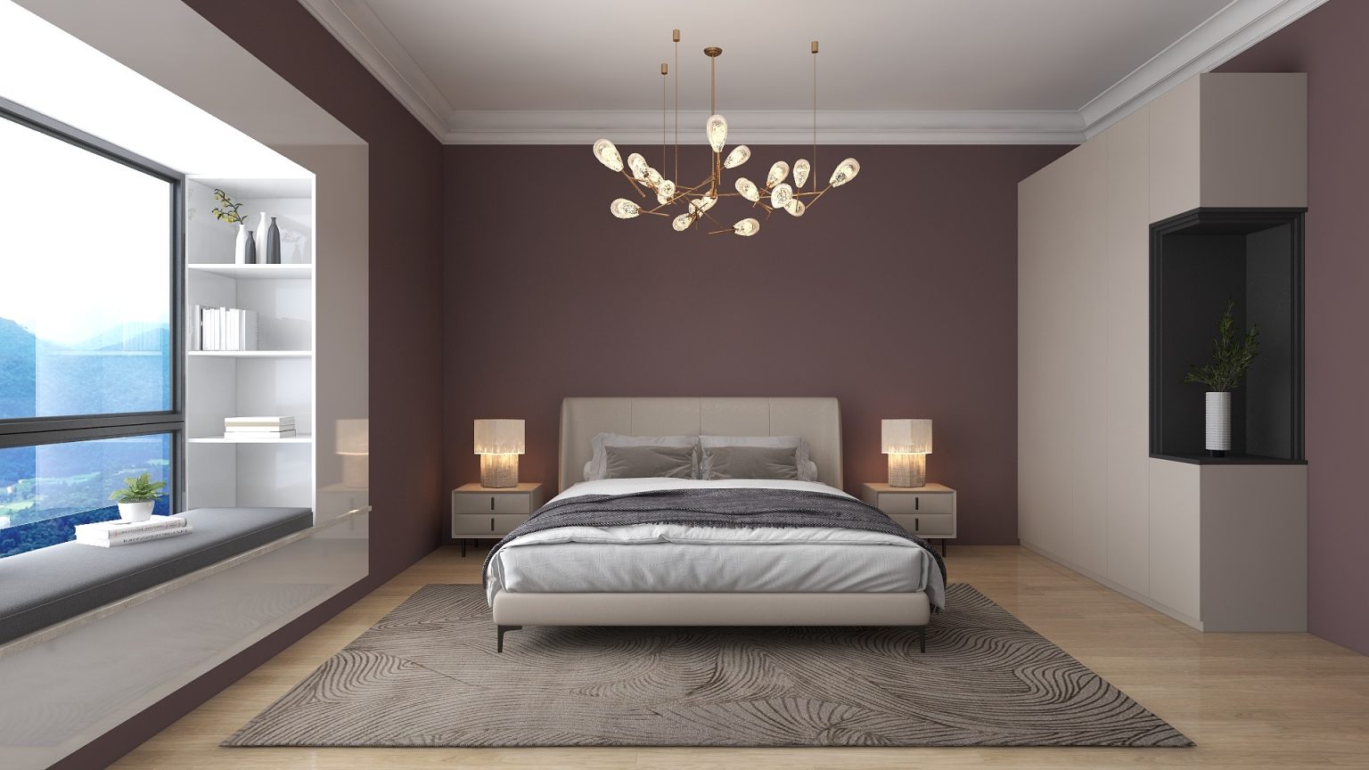
This year, both Sherwin-Williams and Benjamin Moore took their picks in different directions. Instead of a single color, Sherwin-Williams released a 2025 Color Capsule of the Year, a collection of 9 colors that represent the top choices for the year. Benjamin Moore, on the other hand, picked one Color of the Year 2025: Cinnamon Slate 2113-40. Described as a blend of heathered plum and velvety brown, it’s a bit more daring than most neutrals we see people gravitate towards. In addition to Cinnamon Slate, though, Benjamin Moore also released a 2025 Color Trends Palette.
Now, here’s where things get interesting. While I don’t think my clientele will rush out to paint their walls with Benjamin Moore’s Cinnamon Slate, I do see a good portion of the other colors in their trend palette catching on. Out of the 10 colors they picked, I believe at least 7 are likely to appeal to those who lean towards neutrals and soft tones.
Sherwin-Williams’ Color Capsule of the Year includes Grounded, Sunbleached, Chartreuse, Bosc Pear, White Snow, Rain Cloud, Clove, Malabar, and Mauve Finery. Out of these, I can see my clients using maybe 6 of the colors in real projects. These shades—particularly the softer and more earthy tones—fall right in line with the neutral color trends people naturally gravitate toward. The earthy warmth of Clove, the softness of Sunbleached, and the brightness of White Snow are especially versatile choices.
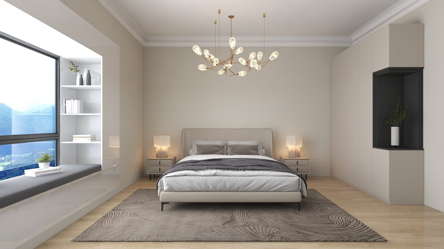
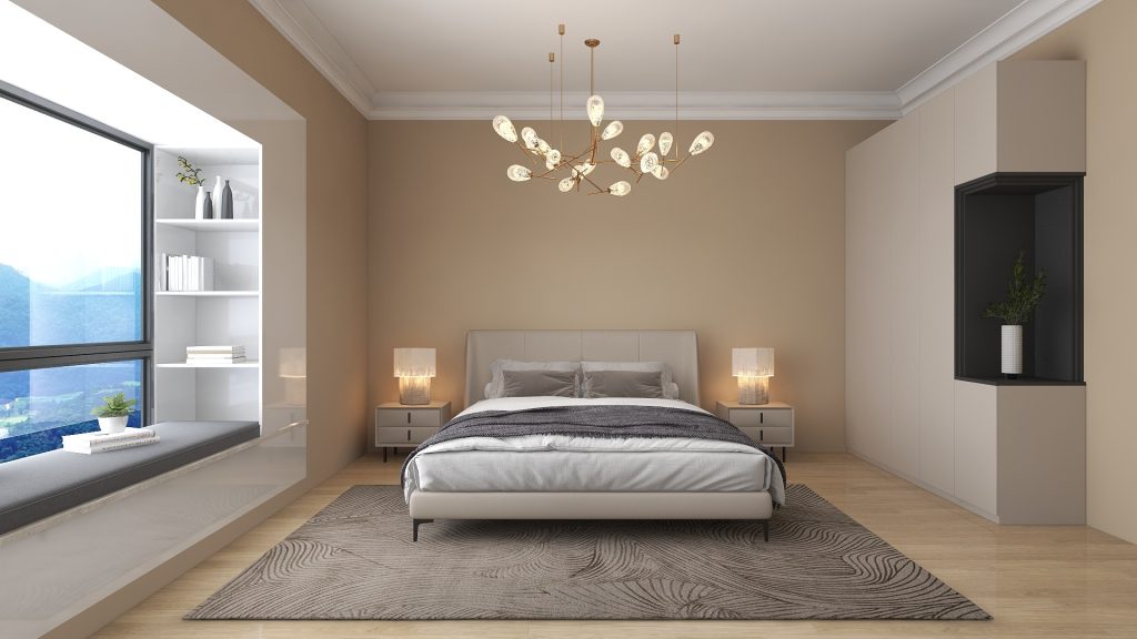
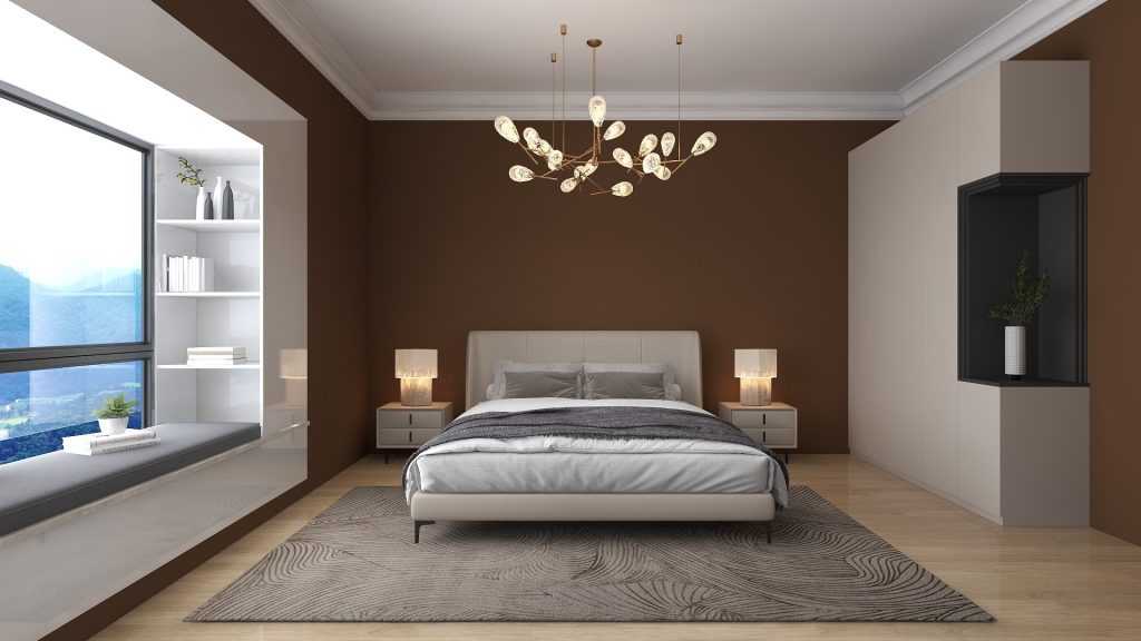
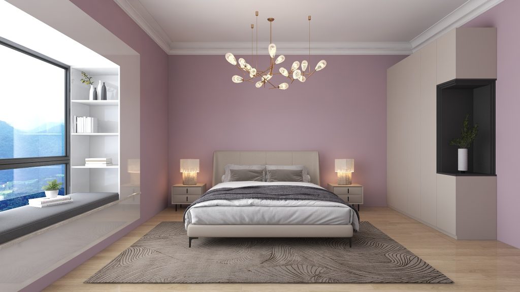
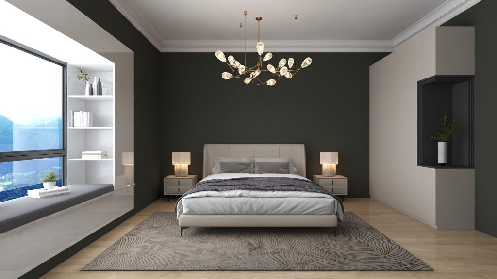
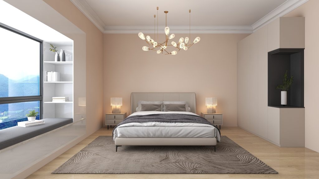
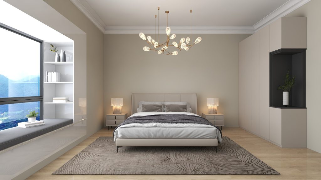
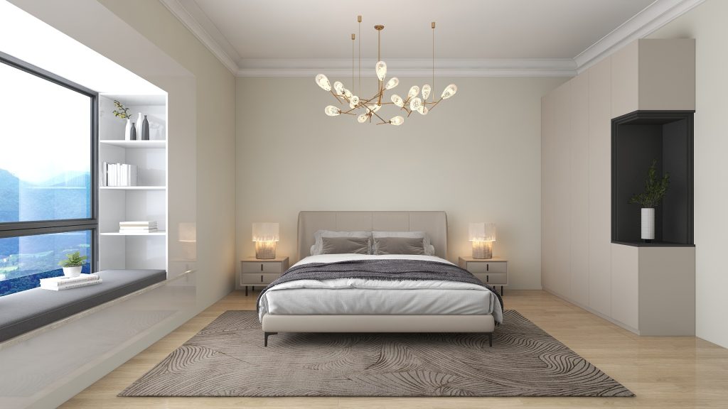
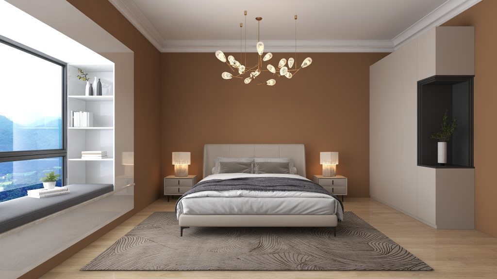
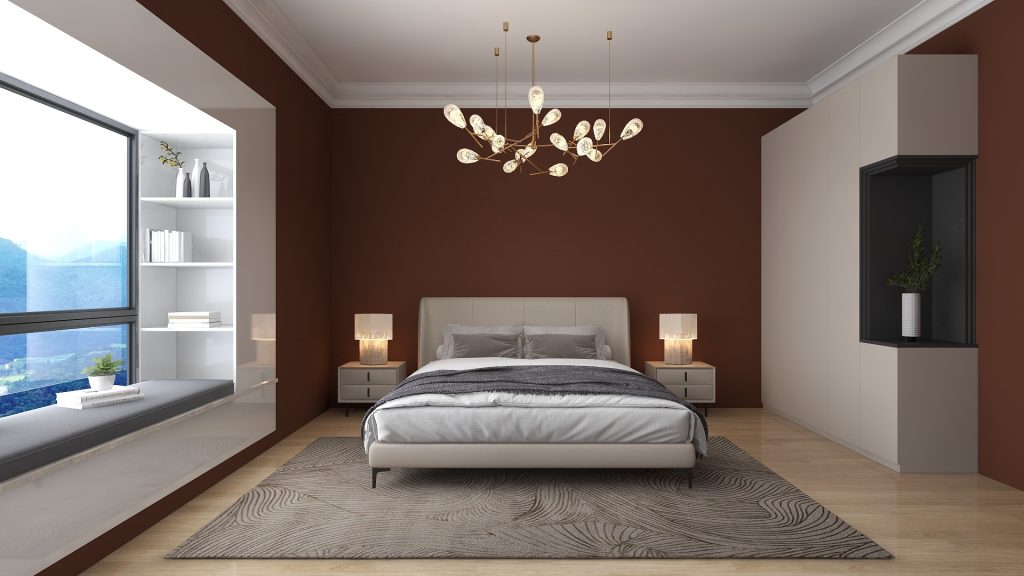
To bring Sherwin-Williams’ 2025 Color Capsule to life, I’ve created a series of renders showing the same bedroom with walls painted in each of the nine selected hues. This allows you to see firsthand how each color transforms the mood and feel of the room.
These are my three favorite ones:
SW 9585 Sunbleached
SW 9605 Clove
SW 9639 Raincloud
Next, I think these other three colors are also quite versatile.
SW 9110 Malabar
SW 6089 Grounded
SW 9454 White Snow
As for the last three, I don’t see them being applied very often.
SW 6390 Bosc Pear
SW 6282 Mauve Finery
SW 0073 Chartreuse
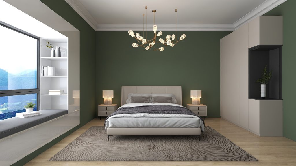
Benjamin Moore's trend palette
Benjamin Moore’s trend palette is similarly appealing, with hues that offer subtle charm and warmth without being overly bold, making them practical picks for many interiors. They keep things classic while still offering a sense of freshness. I find BM’s hues more usable overall. The palette includes: Sea Salt, Leather Saddle Brown, Chawning’s Tan, Tissue Pink, Stained Glass, Ashwood Moss, Rosepine, Paris Rain, Glacier White, and Cinnamon Slate.
Let’s start with Cinnamon Slate, their color of the year.
BM 2113-40 Cinnamon Slate
These are the ones that I like the most:
BM 1484 Ashwood Moss
BM 1163 Tissue Pink
BM 1501 Paris Rain
Followed by:
BM 461 Rosepine
BM CSP 95 Sea Salt
BM OC-37 Glacier White
Even though these last three colors are at the bottom of my preference scale, I do think they can be a good option for many projects.
BM CW-195 Chowning’s Tan
BM 2100-20 Leather Saddle Brown
BM CSP-685 Stained Glass
The key here is flexibility. The Color of the Year can be fun and inspiring, but it doesn’t always match what people want in their homes. By offering a range, Sherwin-Williams and Benjamin Moore let us see broader trends that reflect how people actually use color—leaning into neutrals with character, but not veering too far from tones we know and love.